Wednesday, 19 June 2013

FROM NORWAY: NORDIC INSPIRATIONS FOR CANADIAN LANDSCAPE ART

FROM NORWAY: NORDIC INSPIRATIONS FOR CANADIAN LANDSCAPE ART

Before the close of the 18th century the wilderness was considered uncomely. People didn’t venture out into the ‘wild’ without purpose, particularly not for the sake of sheer pleasure. The enjoyment of nature was confined to that which was tamed by man: such as gardens or hunting parks. Only through necessity would travellers brave the mountain passes of the Alps or traverse the heavily wooded roads of the hinterland. Scarcely would people seek their solace or entertainment in backcountry, this would not have been considered an enjoyable affair. Yet, somehow in the era of romanticism this all began to change. The late 18th century brought the onset of a romantic ideology concerning the natural world that permeated into popular thought throughout the course of the 19th century. By the mid 19th century when nation building and nationalism was widespread, landscapes once detested began to take on new significance in many parts of the world.

These changing perceptions were embraced gladly in Nordic countries. It became beneficial to Norway, Sweden, Denmark and Finland to represent their landscape through art as a symbol of nationalistic pride. The rustic north was transformed from something to cower from into something of stoic beauty and something to exemplify the tough character of its people. In the 19th century Nordic mindset, the northern landscape was unique and special. This new found pride in ‘northerness’ conveniently coincided with the period in history that saw en plein air painting fervently take flight. This timely combination of the popularity of painting en plein air (especially in an increasingly impressionistic manner) and the cherishing of a landscape with a northern climate, topography, and natural light was to produce a distinct style of en plein air art in Scandinavian countries between 1880-1920 that would foreshadow the artistically brilliant landscape art in Canada in the early 20th century.

In Canada in the years around 1910, a group of restlessly ambitious fellow artists clung together as colleagues in the reputable commercial design firms of Toronto, as friends at the Arts and Letters Club, and as individuals sharing some yet fulfilled purpose to find through landscape art that which would truly glorify the Canadian landscape. In 1912 when two of these fellows, Lawren Harris and J.E.H. MacDonald headed to Buffalo, New York to casually view an exhibition of contemporary Scandinavian art, they likely did not intend to be confronted with a stylistic inspiration that would launch this fellowship of Canadian artists full force into their own nationalistic landscape art movement.

At the Buffalo exhibition Harris was struck by the similar ‘northerness’ found between the Canadian and Scandinavian landscape. He and his peers found parallels between what these nationalistic artists have achieved in their depictions of the northern landscape and the visions and ideals he and his peers hoped to realize for Canadian art. Harris said himself:

It is the enduring credit of the leading Scandinavian countries that they may be counted among those fortunate peoples who, despite external influences, have stoutly guarded their native artistic birthright. Their achievements in the field of painting, sculpture, architecture, and industrial design are refreshingly and unmistakably their own.

Directly from the Nasjonalgaleriet in Oslo, I would like to share some pictures of Norwegian landscape paintings from 1880-1920 that would have had an influence on the Group of Seven and their followers. Perhaps with the exception of Harald Sohlberg's Winter's Night in Rondane 1914, hopefully these findings present less publicized examples that illustrate the profound effect that Scandinavian art has had on Canadian art history.

By: Jill Turner

Photo credits:

1. Harald Sohlberg (Norwegian) Winter's Night in Rondane 1914 oil on canvas Nasjonalmuseet, Oslo

2. Edvard Munch (Norwegian) Flowery Meadown at Veierland 1887 oil on canvas Nasjonalmuseet, Oslo

3. Edvard Munch (Norwegian) Moonlight 1895 oil on canvas Nasjonalmuseet, Oslo

4. Eilif Peterssen (Norwegian) Summer Night 1886 oil on canvas Nasjonalmuseet, Oslo

5. Harald Sohlberg (Norwegian) Flower Meadow in the North 1905 oil on canvas Nasjonalmuseet, Oslo

6. Thorvald Erichson (Norwegian) Wooded landscape 1900 oil on canvas Nasjonalmuseet, Oslo

7. Harald Sohlberg (Norwegian) Summer Night 1904 oil on canvas Nasjonalmuseet, Oslo

Wednesday, 29 May 2013

HOW GOOD IS YOUR BACKSIDE: BEHIND PAINTINGS

HOW GOOD IS YOUR BACKSIDE: BEHIND PAINTINGS

Years ago I was wrapping up my undergraduate studies in art history and history, pondering my next steps. Looking back, I sheepishly admit that at the time a movie The Red Violin helped inspire me to continue towards a career in fine arts. The Red Violin is essentially a cinematic ‘provenance’ of an important 17th century violin. The plot follows the violin from its creation through all its subsequent ownerships and travels, whilst shifting back and forth to the contemporary specialists conducting extensive research upon the piece before it could be offered for commercial sale. I was absolutely captivated by the efforts made to research the entire history of ownership and whereabouts of this important violin, in an attempt to augment its credibility and worth. Most fortunately, such efforts are equally endeavored in the fine arts. Equipped with a new fervour to seriously pursue a career, I knew that I would oftentimes have the pleasure of investigating art. One soon finds that one of the best ways to delve into a historical painting’s past starts first by flipping it over.

A painting’s backside, aka verso, can be devoid of or richly adorned with notations, labels, seals, numbers, stamps and symbols. All of the above can be of great assistance when trying to piece together the: who, what, when, where, and how of a painting. Typically, for historical art the more decorous the backside the more beneficial. For this reason, the backside of a painting can be just as visually and intellectually rewarding as the imagery on the front. Artists’ finest works tend to be exhibited more often, leaving them covered with the labels of exhibitions and authoritative art galleries. Peter Ohler Jr. remembers years ago the awe of flipping over a very fine Lawren Harris panel Isolated Peak to find the backside was completely filled up by various show and gallery labels, with barely a square inch unadorned. He recalls now that the back panel was “like an old suitcase that had travelled around the world.” Everywhere a suitcase had been, it picked up another memento on location.

Some of the many things that can help in researching authenticity and provenance that you might find on the backside of a painting include old gallery and exhibition labels, estate stamps, signatures, hand-written notations, framers and art suppliers stickers, numbers, seals and ex-owners names. Historical Canadian art has many such clues. Old gallery labels for well respected dealers and galleries are desirable additions to the painting’s verso; they reinforce the merit of a work based on the knowledge that informed specialists of a previous era also heralded the work. If authentic, the antiquated labels themselves can physically attest to the genuine vintage of a painting. Some gallery labels from bygone eras in Canadian art history that are esteemed include the Laing Galleries, McCready Galleries, Dominion Gallery, Scott & Sons, Watson Galleries.

Another preferred type of label is that of the public institutions’ or societies’ exhibitions. These typically indicate that the work of art has been included in an organized showcase, implying that the work of art was previously well regarded. In some way or another the work held enough significance to warrant inclusion in an exhibition. Some examples of labels that denote important exhibitions are Canadian National Exhibition Graphis Arts Dept. labels, old Art Gallery of Toronto labels (now the Art Gallery of Ontario), Royal Canadian Academy annual exhibitions, or other museum shows, or shows abroad.

There are all sorts of notations hand-written on the back of paintings: scribbles, symbols, inventory numbers etc. Artists themselves might sign, title, date or make notes on the verso instead of or in addition to the front. Friends, family or experts of an artist have also been widely known to inventory, authenticate or categorize paintings in the artist’s absence or death. When Harris was in New Hampshire, he had Doris Mills inventory all of his work that remained in the Studio Building and various places around Toronto. She marked the back of his panels with a fractioned number, such as 1/26. The first number represents a grouping by subject matter: one for Arctic sketches, two for Algoma sketches, three for houses, four for Lake Superior and so on until group eight. The second number was the order in which she inventoried each group. After Tom Thomson’s untimely death his fellow artists stamped the sketches that remained in the studio with a monogram designed by J.E.H. MacDonald, and he and Lawren Harris noted ‘Not for Sale’ and ‘First Class’ to those they considered the finest.

By: Jill Turner

Have you ever wondered what something on the backside of your Canadian painting means? We invite you to EMAIL US pictures of anything you might be curious about, and we will see of we can investigate your backside.

Wednesday, 1 May 2013

THE PRACTICAL PHOTOGRAPH...

The Practical Photograph and the Diminishing Decadence of Descriptions

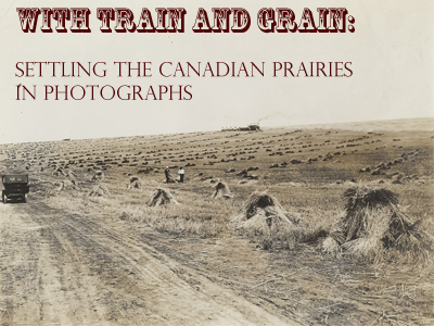
The gallery has had ample opportunities to reflect upon the advent of photography over the past year. We had a successful show of Richard Henry Trueman photographs of British Columbia and the Rockies from the late 19th century, and more recently we have had an online sale and show of early 20th century photographs called With Train and Grain: Expanding the Canadian Prairies in Photograph. We have also had the opportunity to develop a permanent presence for available historical photographs on our website, including a variety of Western Canadian subjects by numerous photographers.

Upon reflection it is amazing to see how far photography has come in a mere two centuries, especially when compared against other developments spanning thousands of years of art history. Not only is photography a highly respected form of fine art; it has also proven to be integral for documentation and visual aid. Today many photographers take pictures, or use photography in whole or part, with creative aims in mind. From the mid-19th century photographers used early photographic processes to document what they saw around them. Documenting the expansion of the Canadian Pacific Railway line westwards is a good example. Photography is also ever increasingly used as a visual aid, exemplified in the academic and commercial art industry alone through art history textbooks and art catalogues to the images used for online shopping.

The use of photography in daily life, and the art industry more specifically, has come so far it is difficult to imagine picking up an art catalogue or textbook with no photographs for visual reference. Before the widespread use of photography and improved printing techniques, how would an author or cataloguer relay what the art being discussed looked like to readers who haven’t seen the art? Some books and catalogues would include engravings copying paintings being discussed, but this would be far too costly and time consuming for a large or multi-volume catalogue of art. If an author or cataloguer wanted to give a sense of what a picture looked like it, they would simply have to describe it in writing, usually in great detail. Such was the case for picture dealer John Smith’s multi-volume A Catalogue raisonne of the works of the most eminent Dutch, Flemish and French Painters published in editions between 1829 and 1908 (most of which published in the 1830s).

The need for descriptive cataloguing has diminished nearly to redundancy since photography has been used in book publishing. When one can look at images of paintings the use of lavish and prose-like wording to describe art is no longer necessary, and may even seem like a foreign concept today. However, in 1829 when John Smith embarked upon cataloguing Old Master paintings in private and public collections across Europe wordy descriptions were necessary for the reader to visualize the paintings in the epic catalogue raisonne. In the 19th century cataloguers would have been well practiced at flowery cataloguing; but to today’s readers the style of these entries might seem over-the-top and even comical. I will conclude by leaving you with a selection of entertaining descriptions of Dutch Old Master genre painting entries from A Catalogue raisonne of the works of the most eminent Dutch, Flemish and French Painters. They attempt to convey the quality, mood, and/ or detail of the paintings being discussed. I hope you find them as amusing as I do!

1. A Pig-sty- of a highly picturesque appearance, in which are three hogs luxuriating in filth. A tub, partly overturned, and other objects, complete a picture which exhibits a faithful transcript of nature.

2. Twelfth Night- The subject is composed of about twenty persons, most of whom are exhilarated with liquor, and are indulging in the gayest excesses of mirth and jollity. Among the various groups may be noticed an old fellow (probably the king of the evening’s amusement), wearing a yellow dress and a napkin round his head, completely inebriated, whom a man and a woman are lifting on a table.

3. A Lady and her Page- This superlative bijoux of art represents the portrait of a lady of singular beauty, about twenty-three years of age; her fair countenance is seen in nearly a front view, and her dark hair is tastefully disposed in curls. She is elegantly attired in a white satin robe….she is attended by a page, habited in the fanciful costume of the period…

4. Villagers Merry-making- The scene of hilarity is represented as passing in front of a house of a picturesque appearance…. Mirth and conviviality prevail throughout the piece.

5. The Angry Man- A gentleman elegantly habited in a yellow jacket, with slashed sleeves, and blue hose; his countenance agitated with anger, and his right hand grasping the hilt of his sword, which he is in the act of drawing from its scabbard.

6. Villagers dancing and regaling- The cheerful scene is passing in front of some cottages occupying the right of the picture, one of which is distinguished by a vine growing luxuriantly over some trellis-work … A social group of four persons may also be noticed under the shade of the trellis-work, and in addition to these are an old man seated near a tilted cart with a jug in his hand, and the mirth-stirring fiddler mounted on a tub. The more distant scenery exhibits a continuation of the village. This most enchanting work of art is dated 1660.

7. A Hurdy-Gurdy Player- A merry fellow, of a florid complexion wearing a black slouched hat, and a dark purplish coloured cloak over a yellowish jacket. He is seated, playing an instrument. The figure in this clever little picture is seen to the middle.

All excerpts extracted from John Smith’s A Catalogue raisonne of the works of the most eminent Dutch, Flemish and French Painters published in editions between 1829 and 1908

By: Jill Turner

Photo credits

1 and 2. Exhibition posters for Masters Gallery shows featuring historical photography.

3. A historical photograph documenting a Frontier funeral (from a Yukon album)

4. An example of a contemporary art catalogue displaying high resolution colour photographs of the paintings in an exhibition (Masters Gallery Calgary's 30th Anniversary exhibition)

5. Interior title page of a 1908 edition of John Smith's A Catalogue Raisonne of the most eminent Dutch, Flemish, and French Painters.

Friday, 12 April 2013

SOME NOTES ON DRAWINGS

SOME NOTES ON DRAWINGS

Drawing is a noteworthy medium within the connoisseurship of fine art; being important to both collectors and art historians. Drawings can be an excellent choice for collectors who can frame their collections around the medium or include them to complete the story of a specific artist’s oeuvre. Novice and discerning collectors will recognize that drawings can be a good starting point for an art collection. As works on paper, drawings are often an affordable way of obtaining outstanding examples by highly marketable or historically significant artists whose paintings on panel or canvas sell in the highest, and often less obtainable, league. Furthermore, the medium is often used for sketching in the preliminary stages of an artistic process, and can therefore be used by historians and connoisseurs for research and insight into an artist’s techniques. Drawing can also be intentionally used as the medium of choice for a stand-alone finished work of art, often adding an additional dimension to an artist’s oeuvre.

For Group of Seven artists such as Lawren Harris and A.Y. Jackson, whose drawings have both been published, the medium was frequently used for rapid sketchbook notations en plein air. Their drawings often preceded the popular oil panel sketches that the Group members are known for, and marked the first step towards a finished panel or even canvas. In a publication of Harris’s sketchbook drawings art historian Joan Murray remarked that, “drawings take us some distance into the artistic life of Lawren Harris.” Harris’ sketchbook drawings were intimate and display quick yet accomplished draughtsmanship; which often included notations regarding colour, place or theme as seen in White Mountains, near Sugarloaf, New Hampshire. They were not necessarily intended to be seen by the public. The drawings with notations are an excellent primary source for research and understanding the artists. Well-known artists and friend of Harris noted that “his drawings are a key which open the door to what he was thinking and painting.

Lawren Harris himself understood the importance of drawings in an artist’s career; not just as studies for finished works, but as completed works of art themselves. He wrote an essay in 1945 to accompany his friend Emily Carr’s retrospective exhibition. Within he devoted much attention to her charcoal drawings. He felt that her charcoal drawings held “her widest range of expression and experimentation.” Emily Carr used drawing both as a means to flesh out ideas for the bigger picture and for completed works of art. In her 1990 publication Emily Carr, Doris Shadbolt proclaimed, “drawing was a natural habit with Carr…[and] is an important and relatively little-known body of her work.” Shadbolt stated that Carr produced innumerable drawings for nature in pencil, charcoal, or brush, ranging from small sketchbook drawings… to more developed compositions, like Inside a Forest. Shadbolt mentioned that a group of, “small sketchbooks first in 1929 and 1930 were the basis for a group of studio drawings done at the same time but of a larger format… and on good quality paper,” as seen in Inside a Forest. Like Lawren Harris, Doris Shadbolt insisted upon the importance of Carr’s drawings to “tell us about…[the] inventive artist.”

Another British Columbian artist who is well-known for using meticulously detailed graphite sketches as the first step towards subsequently creating watercolours and then finally canvases, was E.J. Hughes. Like Harris, he would include notations throughout. However, he too was know to use the medium for completed works of art, as seen in his graphite portrait of F.W. Guernsey.

With the credit that scholars have given to drawings, and the real feasibility of adding them to art collections, drawing is clearly a fine art medium that warrants a good look!

By: Jill Turner

Photo credits:

1. Lawren Harris White Mountains, near Sugarloaf, New Hampshire, 1935, graphite on paper

2. Emily Carr Inside a Forest charcoal on paper, circa 1929-30, 24.5 x 29 in.

3. E.J. Hughes Portrait of F.W. Guernsey, Stanley Park Fort graphite on paper

Thursday, 28 March 2013

CANADIAN ARTISTS IN EUROPE

CANADIAN ARTISTS IN EUROPE

A great majority of acclaimed Canadian artists throughout the past two centuries have spent time in Europe nurturing their artistic careers. Canadian art throughout the 19th and 20th centuries has always embodied a distinct ‘Canadianness’; whether this is the romantic landscapes of Krieghoff and Kane, Canadian Impressionism, or the more distinct Group of Seven and their followers. However, most important Canadian artists have travelled to Europe to study, and in some cases taken up permanent residency. Particularly in Paris, artists have found a stimulating and supportive environment for developing their artistic careers. Although work executed on Canadian soil and of Canadian subjects might be of greater interest to some, it cannot be overlooked that for many Canadian artists their work in Europe has reflected pivotal periods in their careers.

In the late 19th and early 20th centuries, Canadian artists in Paris would have immersed themselves in an all-encompassing artistic environment. They would spend their days in training at the Ecole des Beaux-Arts, the Academie Colarossi or the Academie Julian. They would then spend free time congregating with their peers in the creative climate of the boulevard cafes. At this time, Impressionist and subsequently Post-Impressionist movements were at their heights, and both would have lasting effects on visiting Canadians. William Brymner was the first to go and experience Impressionism first hand. He took much away from this experience, and encouraged his own art students back in Montreal to take post-graduate courses in Europe. Artists who travelled to study in Paris academies or elsewhere in Europe included Blair Bruce, Paul Peel, J.W. Morrice, A.Y. Jackson, Suzor-Cote, Edwin Holgate, Albert Robinson, Clarence Gagnon, Laura Muntz, George Reid, Maurice Cullen, Frank Armington, William Clapp, Helen McNicoll, Emily Carr, and Robert Pilot.

Emily Carr went to study in Paris in 1911. She recalled that her goal was, “…to find out what this “new art” was about.” She also spent time in Brittany at St. Efflam and Concarneau. This marked a notable turning point in her artistic career. She embraced post-impressionistic ideals; letting go of realistic representation in favour of bold colour and dynamic brushwork.

In 1912, shortly after Emily Carr sojourned in France, Edwin Holgate went to Paris to study at the Academie de la Grande Chaumerie. Like Carr, he also visited Concarneau in Brittany to paint. Holgate was in Russia and then back in France during World War One, and returned in 1920 to Paris to resume studying art, this time at the Academie Julian. His mentor was Russian artist Adolph Millman, whose art would have a lasting stylistic impression on Holgate. In 1922, Holgate travelled to the south of France, including the seaside town of Sanaray, before returning to Canada.

While most Canadian artists returned to Canada after a period of study, some artists remained in Europe permanently. James W. Morrice went to Paris in 1890, where he first studied at the Academie Julian and later under tutelage of Barbizon painter Henri Harpignies. Morrice befriended those in artistic circles of the time, easily transitioning into the boulevard café lifestyle. Morrice returned almost yearly to Canada for visits, and associated with Canadian artists when they came to Europe, like Maurice Cullen. He made Paris his permanent home, and sketched around Europe frequently. He travelled around France, Italy and Northern Africa. He visited Dennemont and Antwerp in 1906.

Frank Armington was another Canadian artist who made Paris his permanent home from 1905 to 1939. He first went to Paris to study at the Academie Julian in 1899. After a brief few years back in Canada, moved back to Paris with artist wife Caroline. He is known for his impressionistic rendering of Parisian sites, such as the Jardin des Tulieries.

By: Jill Turner

Photo credits:

1. Emily Carr. Portrait of a Woman, Brittany, (France) 1911, watercolour, 14.75 x 11 in.

2. Edwin Holgate. Sanaray (France) 1922, oil on panel, 5.25 x 6.75 in.

3. James W. Morrice. Antwerp (Belgium) 1906, oil on panel, 8.5 x 10.5 in.

4. Frank Armington. Jardin des Tuileries, Paris 1916, oil on canvas, 20 x 24 in.

Tuesday, 12 March 2013

GRAPHIC ARTS IN CANADA

GRAPHIC ARTS IN CANADA

Graphic Arts is a branch of Fine Arts, to which the term covers a broad range of art forms that are most often two-dimensional. Included under the blanket term ‘graphic arts’ are calligraphy, photography, maps, drawing, painting, printmaking, lithography, typography, serigraphy, and bindery; as well as architectural design. This wide-ranging term also covers graphic design, which in general serves as a means of visual communication.

The history of graphic arts and graphic design in Canada suggests many of these art forms have been thriving since the 19th century and into the 20th century. The use of visual communication has been an important factor in the proliferation of many graphic art forms across the country. Historically, we have seen Canadians utilizing and advancing upon innovative and current artistic forms throughout the 19th and 20th centuries.

Evidence of this can be found in the pioneer photography of the mid to late 19th century. Professional and amateur photographers headed westward, either by their own intuition or by subsidizing from entrepreneurs such as the railway companies, to document and promote westward expansion. The desire to communicate the vast splendour of Western Canada led photographers to keep up-to-date with leading International industry advancements. They endeavored to keep pace with British and European photographic improvements all within a few decades from the early daguerreotype of the 1850s through albumen printing in the 1870s and 1880s to the silver gelatin printing process in the 1890s. Photographers would often endure harsh climate and terrain in order to best communicate the landscape to prospective visitors to the west.

The work of cartographers can also be considered a form of the graphic arts, and is one that alongside the popularization by Gutenberg of the printed book has permeated into regular use since the early Renaissance in Europe. In Canada the industry of mapmaking has followed suit, and in conjunction with the proliferation of lithography in the 19th century, a more widespread audience would gain access to such art forms. An example of this is a large scale 1889 map of the city of Victoria, which was made using lithography for wider dissemination. This map provides a detailed account of the city streets and surrounding geography. There are street names, accurately rendered buildings, wandering figures, and a delicate atmospheric rendering of the hills and a distant Mount Baker on the horizon. The publishers, Ellis & Co., also were the publishers of Victoria’s major newspaper, The Tribune.

Some graphic art forms like printmaking can serve purely aesthetic purposes. W.J. Phillips’ exquisite colour woodblock prints share more in common with traditional fine art, such as oil paintings or watercolours. The same could be said for the serigraphs that were commercially produced in the mid 20th century in Canada. The Sampson-Matthews Co. and the Marc Graf Company produced silkscreen prints of well-known artists in order to allow for a wider audience for the art. Though arguably, these Canadian silkscreen projects were still intended for widespread visual communication, considering that they were launched as a means for creating public awareness about Canadian artists.

Perhaps the most well known sub-category of graphic arts is graphic design. Graphic design in Canada has kept up with international innovation throughout the history of modern design. Using visual communication for advertisements or for relaying ideas and messages took flight in the 20th century, for Canada included. The English artist and designer William Morris is often credited as the father of modern design. His ideology and style make him a pioneer of the renowned Arts and Crafts movement in art and design. He contributed to the field of graphic design first through dabbling in calligraphy and illumination with the Pre-Raphaelite Brotherhood, and later with his own typography and the instrumental Kelmscott Press. His illustration, page and book design are the embodiment of Arts and Crafts style, which became prevalent in graphic design in the early 20th century in Britain, Europe and North America. During the opening years of the 20th century, the leading design firms in Canada saw graphic artists working in the popular Arts and Crafts style. This included the design firms of Grip Ltd. and Rous and Mann, where graphic artists very often worked in the Arts and Crafts style. Many of Canada’s most celebrated artists were at some point working at these firms, including most Group of Seven members and Tom Thomson.

Tom Thomson, Quotation from Maurice Maeterlinck, ink of paper (at the McMichael Canadian Art Collection)

The Poster gained rapid popularity worldwide in the early 20th century as a method of visual communication for advertising or propaganda. A staple in the history of graphic design, the poster saw breakthroughs in Germany in the early 20th century, with a fresh new style that utilized few, but bold, colours with a minimal composition in order to easily attract attention. This specific style for posters was called Plakatstil in German. Plakatstil gained popularity worldwide; and Canada was no exception. Akin to the 19th century photographs of the West, bold simple avant-garde posters were designed to entice visitors out west along the railway lines in the 1930s, 1940s and 50s to ski resorts and outdoor adventures. The Canadian ski resort posters of this time are in tune with current International trends in poster design.

Thus, from the 19th century pioneers of historical photography out West, through the prestigious Toronto design firms on the early 20th century, to the avant garde travel posters of the 1940s; Canada has been forefront in the history of modern graphic arts.

By: Jill Turner

Photograph credits

1. Bailey & Neelands, Rogers Pass from Glacier House, B.C. circa 1892

2. 2. Ellis & Co., Bird’s Eye View of Victoria, 1889

3. W.J. Phillips, Jack Pine, colour woodblock print, 1940

4. B.C. Binning/ Sampson Matthews Co., Ships in a Classical Calm, serigraph

5. Peter Ewart, Ski Canada, Poster, 1941

Saturday, 16 February 2013

WESTERN IMPRESSIONS

WESTERN IMPRESSIONS

Emily Carr is probably the best-known Canadian artist to have depicted Northwest Coast First Nations subject matter. Walter J. Phillips is also well known for his interpretations of the native villages at Alert Bay, Mamalilicoola, and Karlukwees, as seen in a previous blog Sketching Trips: W.J. Phillips out the West Coast. In particular, they both excelled at the depiction of totem poles. However, Carr and Phillips were by no means the only artists to have travelled into the more remote regions of the Pacific Northwest to lend their artistic impressions of the First Nations subject matter they encountered. By the end of the 1920s the popularity of taking sketching trips to the Skeena River Region or the Coast to document the First Nations villages and their totem poles was at a peak. Artists from all over the country and abroad were arriving on sketching pilgrimages of cultural tourism.

Already by the late 19th century in Europe and North America, there existed the concept of documenting the art, culture and customs of the indigenous peoples of the Pacific Northwest and elsewhere. This was in response to the prevailing perception that indigenous cultures were both threatened and in decline. In the Pacific Northwest, this was made manifest by the visible decline of the totem pole. The consensus amongst anthropologists, government bodies, and interested parties was that raising awareness about First Nations communities through the proliferation of art and literature would lead to cultural tourism to these communities; and thus, ultimately towards official support for the restoration and preservation of First Nations traditions. In Canada, none supported this notion more fervently than the anthropologist, Marius Barbeau.

Marius Barbeau believed that both exposure and tourism were the key paths to the preservation of First Nations art and culture. Barbeau and artist Langdon Kihn teamed up with publicists of the Canadian National Railway to promote cultural tourism in British Columbia. There was eventual further collaboration with Indian Affairs and the government; whereby and a Totem Pole Restoration Programme was established. It focused on restoring the totem poles of well-travelled tourist routes. Curiously, the restored totem poles were often repositioned in order to face tourist paths more directly. Barbeau travelled with Kihn and later with other artists such as A.Y. Jackson, Edwin Holgate, and Anne Savage to the Skeena River region to document the totem poles of First Nations communities. He published detailed reference guides of the totem poles in the region, and assisted the Canadian National Railway making promotional materials. He ultimately was instrumental in organizing the 1927 National Gallery exhibition Canadian West Coast Art: Native and Modern with director Eric Brown. Artists who had made a name for themselves at the time desired to be included in this new movement that elevated the importance of native art in shaping a nationalist art for Canada. The continual use of totem poles as subject matter in Canadian western art is now historically interesting in it’s own right.

Although the late 1920s was a peak time for artists travelling to sketch the totem poles of the Pacific Northwest, it is worth noting that artists were exploring and rendering the indigenous inhabitants of British Columbia as far back as the late 18th century through the opening years of the 20th century. The Victoria-based photographer Richard Maynard accompanied ethnologists to the Queen Charlotte Islands in 1884 and documented villages and individual totem poles in his photographs. Emily Carr first travelled to an Indian Reserve at Ucuelet in 1898 and again in 1904; and continued to travel to Alert Bay and Alaska in 1907 and the Skeena River in 1912. The explorer artist Frederic Marlett Bell-Smith painted at Alert Bay in circa 1909.

By: Jill Turner

Photo Credits: 1. Emily Carr, Modern Indian Graves, circa 1932, oil on canvas, 22.75 x 28.75 in. 2. W.J. Phillips, Venus and the Priest, 1930, colour woodblock print 3. Lowrie Warrener, Heat, Skeena Valley, BC, 1931, oil on panel 4. A photograph of totem poles and building facades at Alert Bay, 1919 5. The cover of Marius Barbeau's totem pole reference 6. Richard Maynard, Masset, photograph 7. Frederic Marlett Bell-Smith, Alert Bay circa 1909, oil on board, 9 x 18 in.