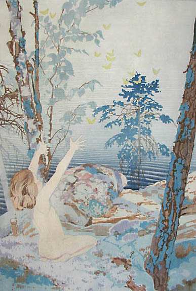
NOT IDLE ARE THE ARTISTS OF SUMMER IDYLLS
This summer Masters Gallery in Calgary has been busy with a great show and sale most fittingly called “Summer Exhibition.” The show has had a wide selection of exceptional works of art including many of summer subject matter. The gallery's website banner page for this exhibition featured the esteemed colour woodblock print Summer Idyll by W.J. Phillips. Summer Idyll perfectly captures the essence of summer, and the peace and pleasure that the season brings. Many people choose to take time off and relax during the fair months of summer. The days are long and the air is warm, and the mood is usually that of general contentment.
For W.J. Phillips and generations of en plein air artists the summer may be relaxing but it is also a time for being very productive outdoors while the good weather permits it. Thus most artists have not been known to sit idle during the summer months, even if they have expertly evoked the idylls of summertime in their work, as W.J. Phillips has done in Summer Idyll. Phillips wrote the following excerpt about working as an artist during the summer:
At midsummer the prevailing, everlasting and monotonous green often sends the artist hurrying to the mountains or the seacoast, chased by swarms of mosquitoes. I spent one memorable night on a tiny remote island on Lake of the Woods. I had neglected to provide myself with cheesecloth or netting, so my head was under a blanket but the noise the pestilent insects made, quarrelling for standing room on the tip of my nose was informal, and rendering sleep impossible. I was up before daylight, and put in this longest sketching day of my experience, beginning with a sketch of the sunrise, and ending when it was too dark to see, with the sunset. There were short intervals for meals. That night we rowed as far away from land as we could, extended ourselves as comfortably as might be along the floor boards of the boat, and incidentally under the seats, letting the boat drift we composed ourselves to sleep, happy in the thought that we had fooled the mosquitoes for once.
Some summer seasons and some districts know not the mosquito. Two of the most delightful summers I have ever known were spent at Lake Muskoka. The greens were as triumphant there as elsewhere, but I refused to let them annoy me. The weather was glorious, the air was soft, the sandy shores inviting, and , best of all, no battalion of mosquitoes rose to the attack when one left the shelter of the cottage, no insectile Amazon pierced one's shrinking epidermis with her horny proboscis. It was impossible to stay indoors. My young family disported itself in the water and along the shore all day long. Here was an exceptional opportunity. I made sketches of the children nude or in bathing suits. They made splendid willing models.

Phillips was by no means the only artist to be thrilled at the prospect of getting outside to sketch prolifically en plein air. In 1889, J.E.H. MacDonald writes to a friend:
I’m still attending the Saturday morning [art] classes [with George Reid], Lewis. And making some progress of course. I can produce a study that has some semblance to the model. But I’m looking forward to greater improvement by outdoor work in the summer. [J.E.H. MacDonald to Lewis, 1889]
Taking advantage of the summer weather has been especially necessary in some of the country’s more formidable climates, such as the Rocky Mountains. From a small town in the British Columbia Rocky Mountains in 1914, A.Y. Jackson wrote about getting ready to depart since the summer weather was waning.
Lucerne B.C. Aug 29th 14. Dear Kids, Just packing up to leave the rocks for their winter rest. […] Great place for the summer here, no hot days to bother one. just pleasant. and cool at nights. Be good. Sincerely Alex
It is widely known that Tom Thomson sketched outdoors in Algonquin every summer from 1912 onwards until his death in 1917. He never took for granted the forgiving weather offered from the late spring through to the autumn. Here is a letter to J.E.H MacDonald dated July 22, 1915 describing the conditions of that particular month sketching and working.
Mowat, Ontario, July 22, 1915 Things are very quiet around the Park this summer, have so far had only 2 or 3 weeks work and prospects are not very bright as the people are not coming in as they were expected Of course there are a few jobs there are more guides than jobs I have made quite a few sketches this summer but lately have not been doing much and have a notion of starting out on a long hike and will likely wind up somewhere around the French River and go up the shore to Bruce Mines and later on may take in the Harvest Excursion and work at Yours truly Tom Thomson
Although brilliant autumn foliage and ethereal snow clad landscapes are mainstays in the history of Canadian art, we must not forget how active artists are and have been during the summertime. The artists' mentioned above are a minute percentage of countless Canadian artists to have brilliantly captured the essence of summertime in their work.
By: Jill Turner


.jpg)